Aligning Stakeholder Vision with User Experience for a Fitness Rewards App

Overview
The team was looking for UI improvements but initial discussions revealed that we were missing data-led discussions and UX vocabulary. So I conducted some workshops to understand the business and UX surveys to create user personas, and finally a detailed competitive analysis. This post deals with the first part of the project.
Problem Statement
The team is brimming with excellent but diverse ideas, and we need to align towards a single vision for a realistic product plan.
Roles & Responsibilities
Worked with Founder & CEO – First Bicycling Mayor of India
Worked with PM, Business Strategy – Ex-Entrepreneur, Ex-Adobe
Supervised Junior UX Designer
My Role – Product Designer
Responsibilities:
- Project Management
- Product Vision Alignment
- UX Research
- UX/UI Design
Process & What we did
Understanding and Aligning Vision
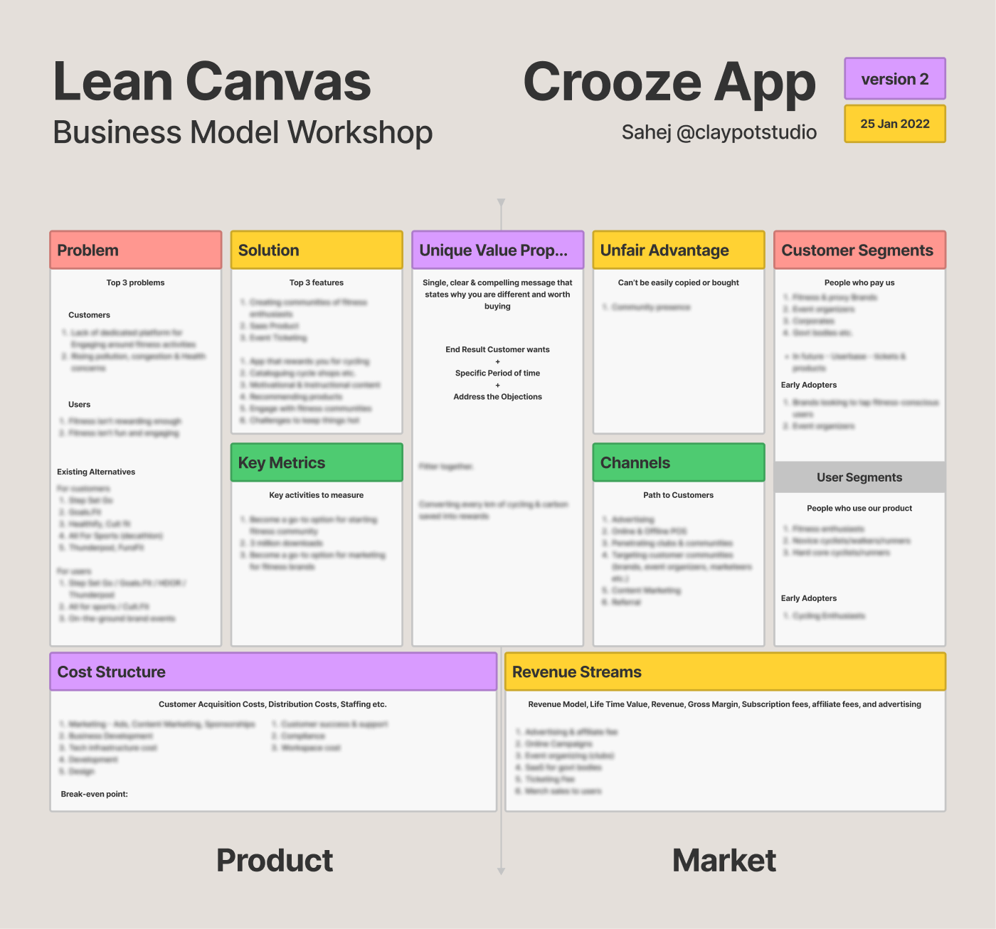
Crooze has a fairly complicated business model. It was critical to understand and also align the vision of the product among the team members before making any changes to the product. I conducted a Lean Canvas workshop.
The best part about these workshops is that they allow us to confront the stakeholders without challenging their vision.

Insight: The value proposition was good for acquiring users but bad for business. We had to switch to a proposition centred along community rather than rewards. This decision had been looming over the team for months, but the workshop allowed to push it over the finish line.
Narrowing Down Product Vision
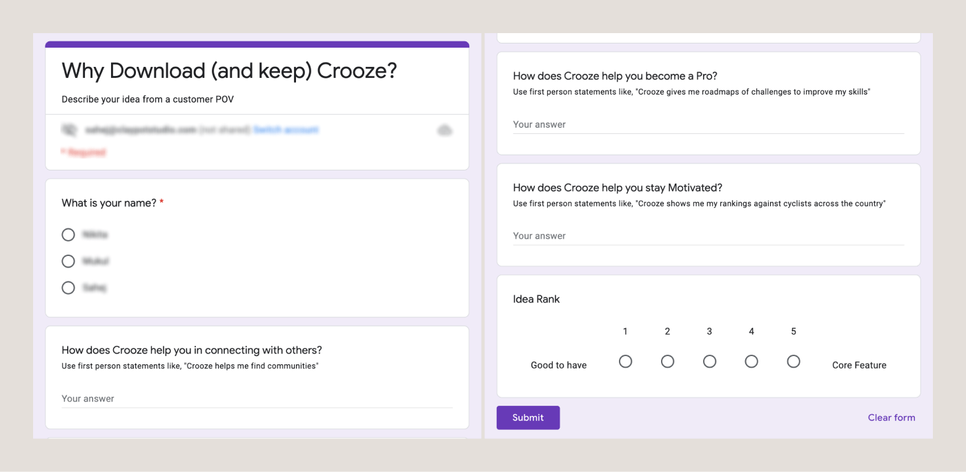
There were gaps in what the product was actually offering. So I asked the stakeholders to support their top four value propositions with first person statements from a user’s point of view. If the stakeholders couldn’t justify it, then it was time to lose it.

Less than 30% of promises were actually supported by the existing product. Most required upgrades and additions, and more than 30% were removed.
Outcome & Results
Conversations became more frank and based on realtime ideas. Distinction was drawn between things Crooze needs to be and things Crooze would like to be in a distant future. We were ready to step into the UX side of things now.
Read about it here.


