Leading the First UX Research for a Fitness Rewards App

Overview
The team was looking for UI improvements but initial discussions revealed that we were missing data-led discussions and UX vocabulary. So I conducted some workshops to understand the business and UX surveys to create user personas, and finally a detailed competitive analysis. This post deals with the second part of the project.
Problem Statement
Existing user insights were wishful or anecdotal. User Personas needed to be corroborated with proper research findings.
Roles & Responsibilities
Worked with Founder & CEO – First Bicycling Mayor of India
Worked with PM, Business Strategy – Ex-Entrepreneur, Ex-Adobe
Supervised Junior UX Designer
My Role – Product Designer
Responsibilities:
- Project Management
- Product Vision Alignment
- UX Research
- UX/UI Design
Scope & Constraints
Scope: Entire UI redesign, Addressing UX gaps & Adding new features
Constraints:
- Very little previous research
- On-ground interviews not possible
Process & What we did
Planning the Survey
Given the scale of the app, we reduced the number of personas down to two from the three earlier. The existing personas gave little insight about user needs and were more like customer personas.
We were not confident about the personas we made, and stakeholders were equally confused. So, we decided to run a user survey to corroborate our hypotheses and generate insights.
A total of 23 questions were selected from six clusters:
- Demographics
- Usage & Approval
- Competition
- Features
- Problem Solving
- Discovery
Most of the questions were objective and some were open ended. We used Google Form for the survey and Google Sheets for analysis.
Incentive & Bias
The current positioning of the app is all about free rewards. This was a great incentive to get survey responses but also introduced bias. As people were expecting to ‘win’ rewards, they were more likely to provide higher approval ratings.
Responses & Analysis
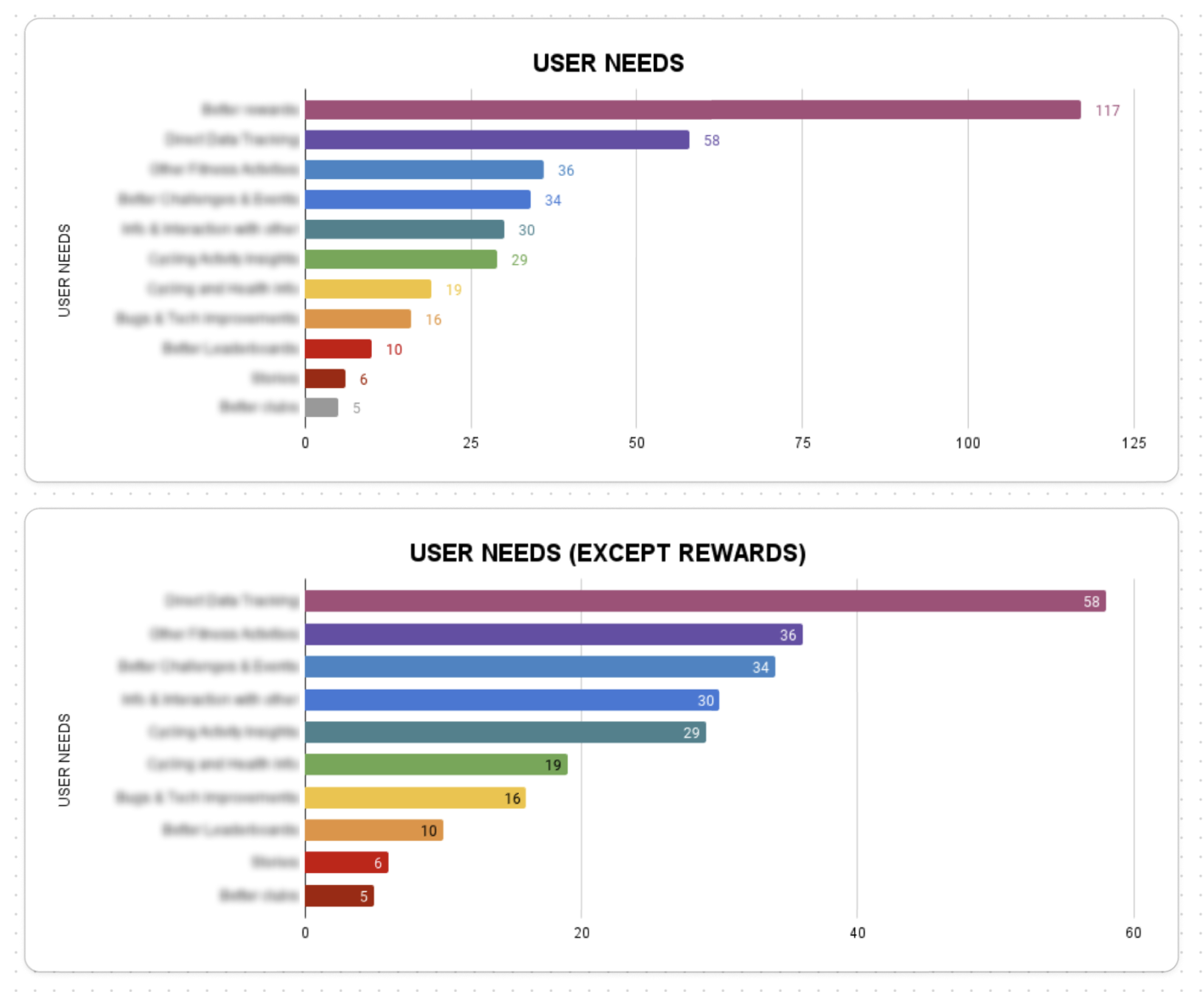
We received an overwhelming response with over 50% active users filling our survey. We had hundreds of open-ended responses, which we further grouped into 11 categories.
Around 30% of the responses were used as first person statements seeking resolution under the following categories:
- Frustrations
- Doubts
- Bug Fixes
- Ideas


Generating Insights
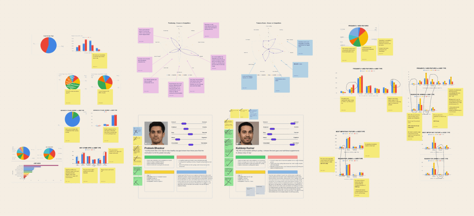
We used more than 50 graphs to analyse the survey responses. Comparisons were drawn based on two main criteria: Age and Level (beginner or professional cyclist).
The insights have been marked confidential and cannot be shared publicly.


Impact & Results
The survey helped us do the following:
- Create more accurate user personas
- Prioritising features and builds based on user feedback
- Invalidate product expectations


1 Comment:
Aligning Stakeholder Vision with User Experience for a Fitness Rewards App – Why Sahej
[…] Read about it here. […]