Designer based in Delhi, India. Helped 50+ Businesses build Designs that pay-off.
OPEN FOR:
Full-time roles in UX/UI Design & Visual Design
Contract work @ Clay Pot Studio
& Pro bono work for Non-profits
Services
Website Design
User Experience Design
Brand Strategy


OPEN FOR:
Full-time roles in UX/UI Design & Visual Design
Contract work @ Clay Pot Studio
& Pro bono work for Non-profits
Contact
Delhi, India
[email protected]
+91 9555615478
Welcome to my Portfolio!
Hi, I’m Sahej and I have been designing, writing & coding for the past 3 years.
I make brilliant designs, but more importantly, I help bring meaning to every tiny design decision through documentation, workshopping and a wide range of skills.
Selected Works
Reducing Perceived Loss for New Fantasy Cricket Players
As of 2022, Skilsta has been indefinitely withdrawn from the market.
Overview
Skilsta is a legal, limited and transparent sport betting game where users create teams based on real-life cricket matches.
Each selected player in the team is granted points based on performance in the real match. Users with top ranking teams (based on overall score at the end of the match) earn cash rewards.

Unlike sports betting, the users are not allowed to swap players once the match goes live and hence a larger emphasis is put on skills rather than luck and momentum.
Problem Statement
New knowledgeable users needs a more rewarding and less penalising gameplay in order to avoid frustration arising from initial losses and focus on systematic and skill-based winning rather than one-off wins.
Users & Audience
Users can be broadly divided into two categories based on gameplay strategy.
Early experience determines their fate to a large extent. Our goal is to convert as many new users to type 2 users.

Users can be broadly divided into two categories based on gameplay strategy.
Early experience determines their fate to a large extent. Our goal is to convert as many new users to type 2 users.

Roles & Responsibilities
Role: Product Designer
My major responsibilities included:
- Translating user insights
- Maximising product potential
- Researching growth opportunity and presenting to key stakeholders
- Ideating possible solutions
- Prototyping & UI Design
Other members:
- Worked with CTO - expert in cricket and algorithms
- Worked with CEO - expert in finance and compliance
Scope & Constraints
Low budget & limited research
The startup had been bootstrapped and was running the pilot and developing the final product for over 2 years. This meant that the budget was really low.
Secondly, due to low budget and time constraints, UX research opportunities were scarce.
We had to settle with competitive analysis and online literature on user behaviour in this niche. Although we had our own user insights but the data was prone to bias as the initial customer base provided for a small sample size.
Process & Solutions
Reducing perceived loss by dampening the outcome curve

New users are less analytical and are prone to trust issues. Their investment choices are driven by feeling rather than data. Thus, we targeted the emotion of loss by simulating the emotion of being rewarded using in-app currency.

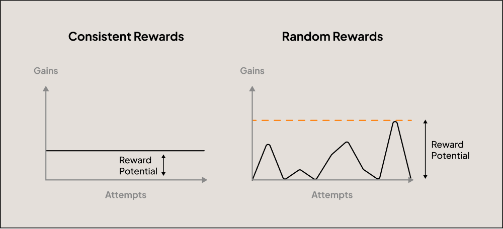
The diagram above explains the relation between perceived loss and simulated winnings. We knew we wanted to introduce an in-app currency. Since the main feature of this currency would be to enable users to join matches, we chose to model it after real-life tickets that are required to watch matches.

The strength of this currency would indirectly influence the perceived loss, hence the next logical step was to work on strengthening the In-App Currency.
Increasing the In-App Currency Value
We based our goals on the mechanics of real world currencies. In simple terms, the value of a currency rises due to these features (and more):
- Lower inflation value → Distribution should be less than expenditure
Tickets were to be distributed from a limited source only. - High purchasing power → Currency should be able to make valuable trades
The highly valuable “Power-ups” could only be purchased using tickets, this made the dealing of tickets necessary for the user. - Strong Economic Performance → Currency bought items should have higher returns (or, have low-risk)
We limited the matches user could join with tickets. Specific low-risk-low-gain matches were chosen for this purpose. These would also make up for losses incurred from regular gameplay.

Blasting Stimuli with Sweepstakes
We imported the high-risk-high-reward principle of betting in a safer, legal and ethical form by introducing randomness in the distribution mechanism. The potential promise of a big reward allows for extra motivation while maintaining the net reward. Further, we decided to disburse occasional mega-winnings (100 tickets) to blast user stimuli.
The Pseudo-hook
While, the primary gameplay incorporates a hook by default, we designed the pseudo-hook to serve as the internal trigger to the main hook.
As a routine feature, users were sent notifications to join a match (external trigger). As the primary goal is to encourage the user to join more matches, we decided to give away a free shot at the sweepstakes (action) in anticipation of Tickets (variable reward) each time the user joins a match (investment). The blasted stimuli would then kick-in to provide additional motivation (internal trigger) to spin the wheel which would in turn provide additional motivation to join a match (internal trigger to the main hook).

Early Prototypes
We were looking towards GPay and PayTM as they had recently introduced gamification to their experience. Some initial wireframes were sketched up.

Final User Interface
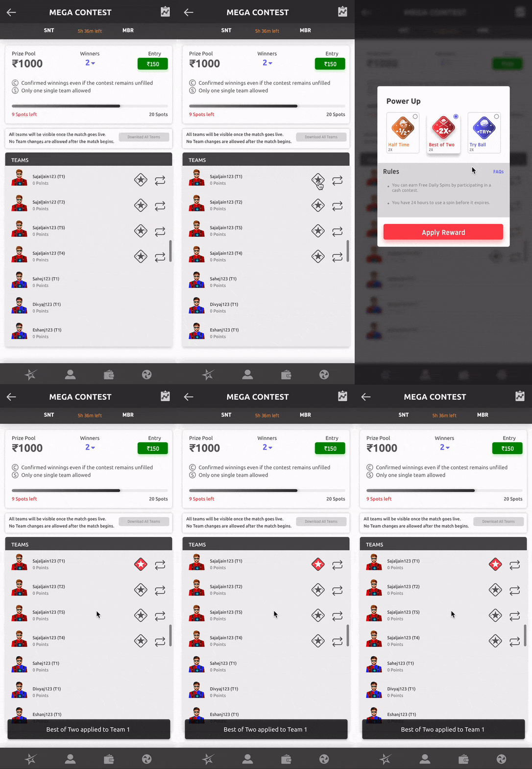
Here are some snaps from the final UI.


Results
Skilsta was withdrawn from the market too early for us to measure results.
Leading the First UX Research for a Fitness Rewards App
Overview
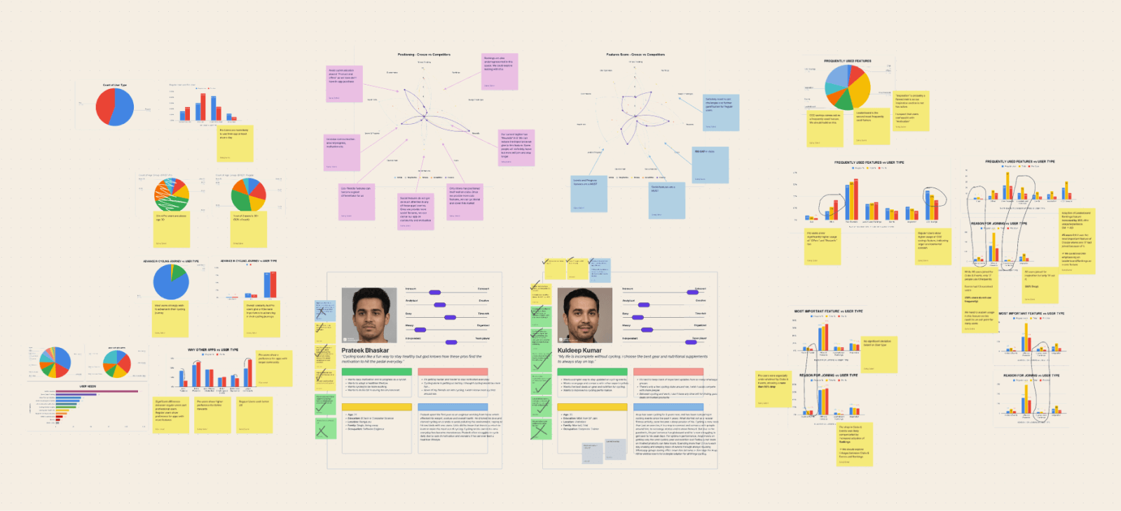
The team was looking for UI improvements but initial discussions revealed that we were missing data-led discussions and UX vocabulary. So I conducted some workshops to understand the business and UX surveys to create user personas, and finally a detailed competitive analysis. This post deals with the second part of the project.
Problem Statement
Existing user insights were wishful or anecdotal. User Personas needed to be corroborated with proper research findings.
Roles & Responsibilities
Worked with Founder & CEO - First Bicycling Mayor of India
Worked with PM, Business Strategy - Ex-Entrepreneur, Ex-Adobe
Supervised Junior UX Designer
My Role - Product Designer
Responsibilities:
- Project Management
- Product Vision Alignment
- UX Research
- UX/UI Design
Scope & Constraints
Scope: Entire UI redesign, Addressing UX gaps & Adding new features
Constraints:
- Very little previous research
- On-ground interviews not possible
Process & What we did
Planning the Survey
Given the scale of the app, we reduced the number of personas down to two from the three earlier. The existing personas gave little insight about user needs and were more like customer personas.
We were not confident about the personas we made, and stakeholders were equally confused. So, we decided to run a user survey to corroborate our hypotheses and generate insights.
A total of 23 questions were selected from six clusters:
- Demographics
- Usage & Approval
- Competition
- Features
- Problem Solving
- Discovery
Most of the questions were objective and some were open ended. We used Google Form for the survey and Google Sheets for analysis.
Incentive & Bias
The current positioning of the app is all about free rewards. This was a great incentive to get survey responses but also introduced bias. As people were expecting to ‘win’ rewards, they were more likely to provide higher approval ratings.
Responses & Analysis
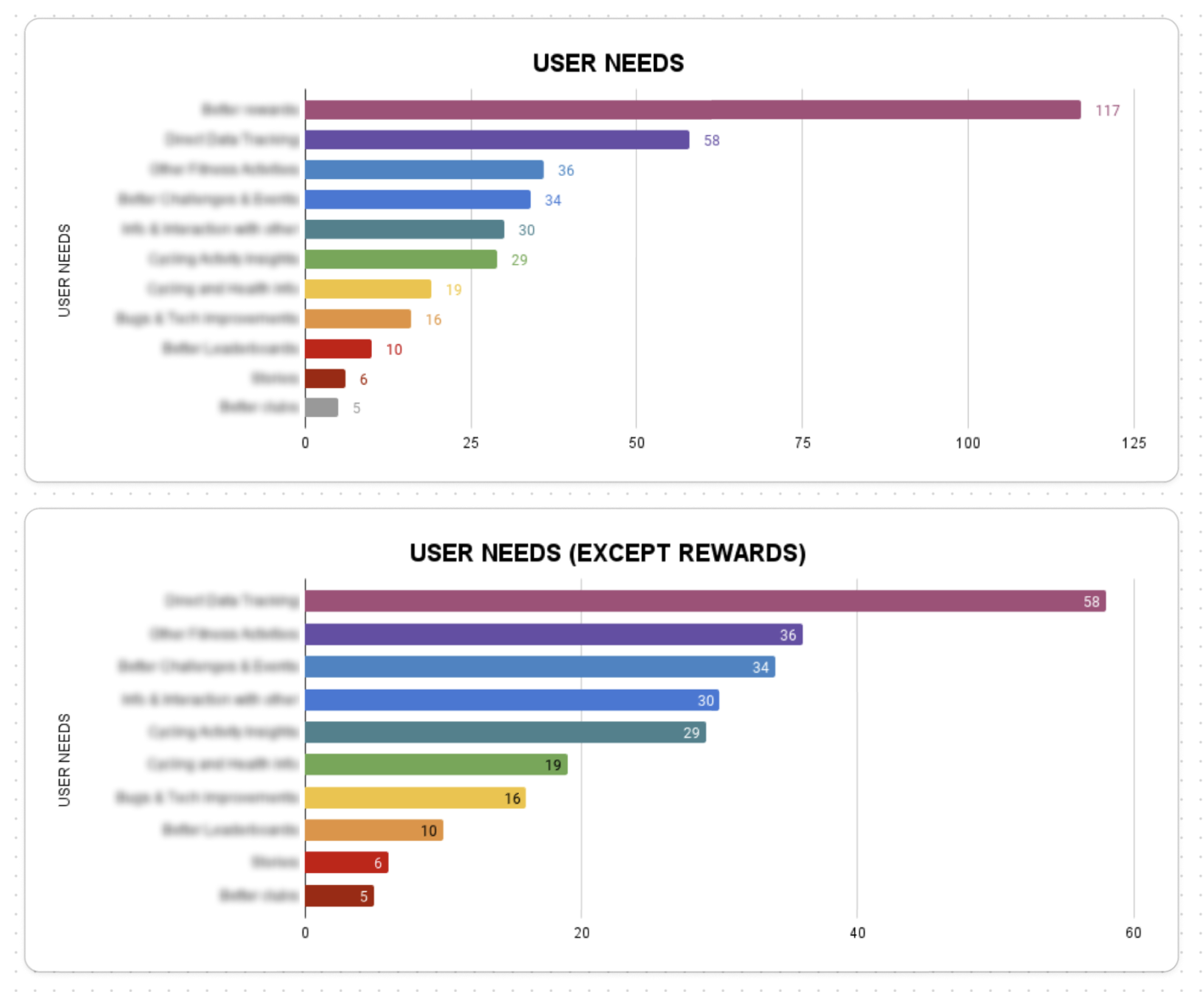
We received an overwhelming response with over 50% active users filling our survey. We had hundreds of open-ended responses, which we further grouped into 11 categories.
Around 30% of the responses were used as first person statements seeking resolution under the following categories:
- Frustrations
- Doubts
- Bug Fixes
- Ideas

Generating Insights
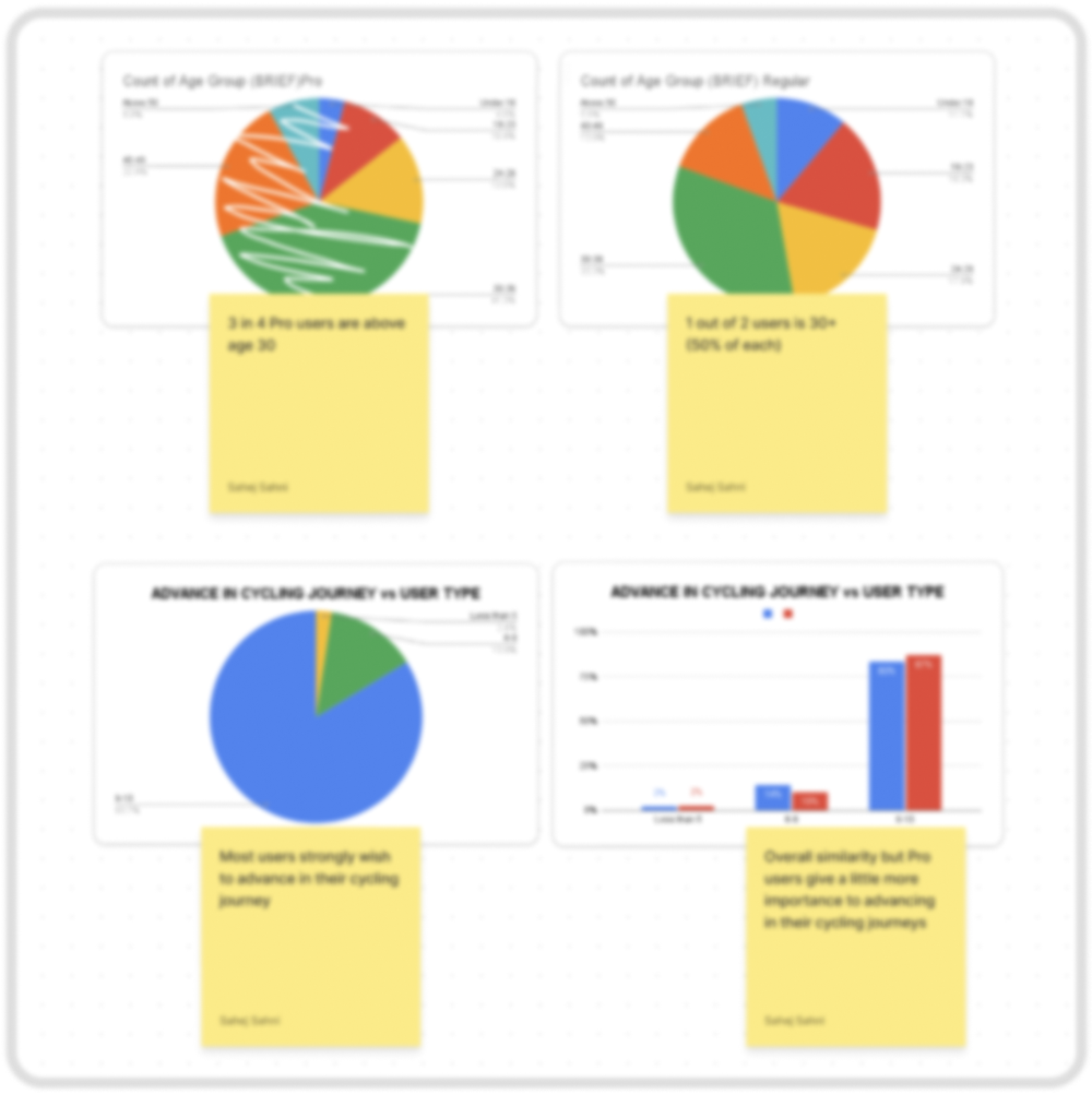
We used more than 50 graphs to analyse the survey responses. Comparisons were drawn based on two main criteria: Age and Level (beginner or professional cyclist).
The insights have been marked confidential and cannot be shared publicly.


Impact & Results
The survey helped us do the following:
- Create more accurate user personas
- Prioritising features and builds based on user feedback
- Invalidate product expectations
Aligning Stakeholder Vision with User Experience for a Fitness Rewards App
Overview
The team was looking for UI improvements but initial discussions revealed that we were missing data-led discussions and UX vocabulary. So I conducted some workshops to understand the business and UX surveys to create user personas, and finally a detailed competitive analysis. This post deals with the first part of the project.
Problem Statement
The team is brimming with excellent but diverse ideas, and we need to align towards a single vision for a realistic product plan.
Roles & Responsibilities
Worked with Founder & CEO - First Bicycling Mayor of India
Worked with PM, Business Strategy - Ex-Entrepreneur, Ex-Adobe
Supervised Junior UX Designer
My Role - Product Designer
Responsibilities:
- Project Management
- Product Vision Alignment
- UX Research
- UX/UI Design
Process & What we did
Understanding and Aligning Vision
Crooze has a fairly complicated business model. It was critical to understand and also align the vision of the product among the team members before making any changes to the product. I conducted a Lean Canvas workshop.
The best part about these workshops is that they allow us to confront the stakeholders without challenging their vision.
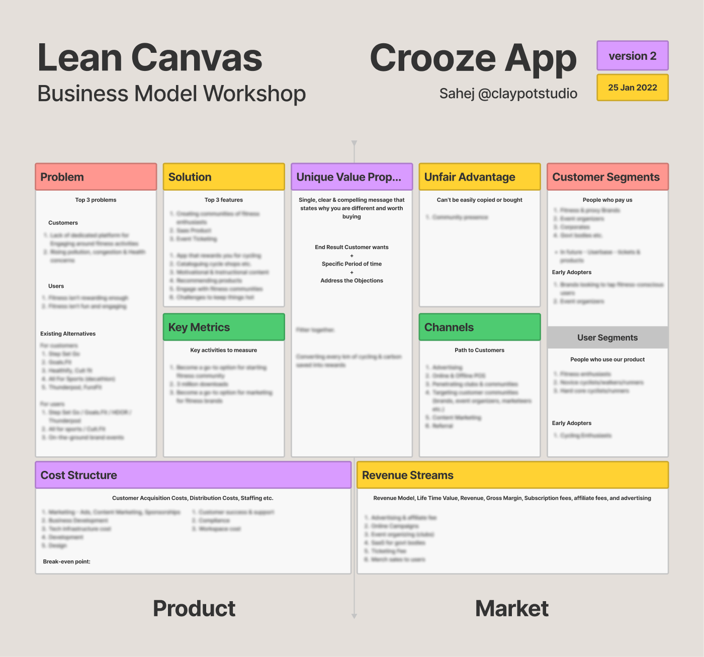
Insight: The value proposition was good for acquiring users but bad for business. We had to switch to a proposition centred along community rather than rewards. This decision had been looming over the team for months, but the workshop allowed to push it over the finish line.
Narrowing Down Product Vision
There were gaps in what the product was actually offering. So I asked the stakeholders to support their top four value propositions with first person statements from a user’s point of view. If the stakeholders couldn’t justify it, then it was time to lose it.
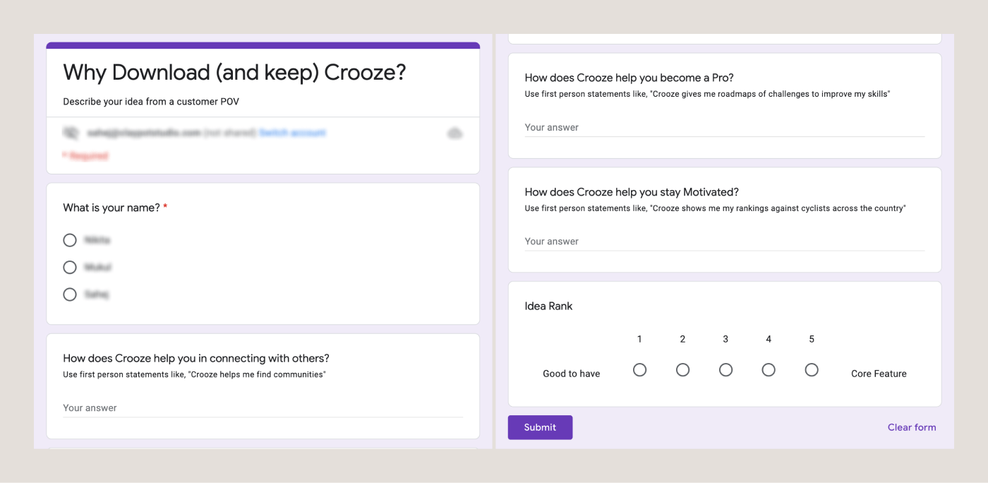
Less than 30% of promises were actually supported by the existing product. Most required upgrades and additions, and more than 30% were removed.
Outcome & Results
Conversations became more frank and based on realtime ideas. Distinction was drawn between things Crooze needs to be and things Crooze would like to be in a distant future. We were ready to step into the UX side of things now.
Read about it here.
A few reasons why people bring me on board

“Once you hire him, consider it done”

“He worked on our brand as if it is his own”

“His designs just make sense!”
Coding and More
I have had a brilliant time working on my own, and running a freelance business has brought me many learnings.
But for my next act, I’m looking for full-time roles so I can:
Contribute to
larger projects

Work within and
across teams

Learn from the
best of the best

If you can make that happen, please Get in Touch!
Skills & Stack
Skills
UX/UI Design
UX Research
Brand Strategy
Copywriting
Graphic Design
Softwares
Figma
Adobe XD
Illustrator
Photoshop
VS Code
Stack
HTML/CSS/JS
Vue JS
WordPress
Eleventy
GSAP


