Portfolio
Reducing Perceived Loss for New Fantasy Cricket Players
As of 2022, Skilsta has been indefinitely withdrawn from the market.
Overview
Skilsta is a legal, limited and transparent sport betting game where users create teams based on real-life cricket matches.
Each selected player in the team is granted points based on performance in the real match. Users with top ranking teams (based on overall score at the end of the match) earn cash rewards.

Unlike sports betting, the users are not allowed to swap players once the match goes live and hence a larger emphasis is put on skills rather than luck and momentum.
Problem Statement
New knowledgeable users needs a more rewarding and less penalising gameplay in order to avoid frustration arising from initial losses and focus on systematic and skill-based winning rather than one-off wins.
Users & Audience
Users can be broadly divided into two categories based on gameplay strategy.
Early experience determines their fate to a large extent. Our goal is to convert as many new users to type 2 users.

Users can be broadly divided into two categories based on gameplay strategy.
Early experience determines their fate to a large extent. Our goal is to convert as many new users to type 2 users.

Roles & Responsibilities
Role: Product Designer
My major responsibilities included:
- Translating user insights
- Maximising product potential
- Researching growth opportunity and presenting to key stakeholders
- Ideating possible solutions
- Prototyping & UI Design
Other members:
- Worked with CTO – expert in cricket and algorithms
- Worked with CEO – expert in finance and compliance
Scope & Constraints
Low budget & limited research
The startup had been bootstrapped and was running the pilot and developing the final product for over 2 years. This meant that the budget was really low.
Secondly, due to low budget and time constraints, UX research opportunities were scarce.
We had to settle with competitive analysis and online literature on user behaviour in this niche. Although we had our own user insights but the data was prone to bias as the initial customer base provided for a small sample size.
Process & Solutions
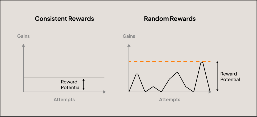
Reducing perceived loss by dampening the outcome curve

New users are less analytical and are prone to trust issues. Their investment choices are driven by feeling rather than data. Thus, we targeted the emotion of loss by simulating the emotion of being rewarded using in-app currency.

The diagram above explains the relation between perceived loss and simulated winnings. We knew we wanted to introduce an in-app currency. Since the main feature of this currency would be to enable users to join matches, we chose to model it after real-life tickets that are required to watch matches.

The strength of this currency would indirectly influence the perceived loss, hence the next logical step was to work on strengthening the In-App Currency.
Increasing the In-App Currency Value
We based our goals on the mechanics of real world currencies. In simple terms, the value of a currency rises due to these features (and more):
- Lower inflation value → Distribution should be less than expenditure
Tickets were to be distributed from a limited source only. - High purchasing power → Currency should be able to make valuable trades
The highly valuable “Power-ups” could only be purchased using tickets, this made the dealing of tickets necessary for the user. - Strong Economic Performance → Currency bought items should have higher returns (or, have low-risk)
We limited the matches user could join with tickets. Specific low-risk-low-gain matches were chosen for this purpose. These would also make up for losses incurred from regular gameplay.

Blasting Stimuli with Sweepstakes
We imported the high-risk-high-reward principle of betting in a safer, legal and ethical form by introducing randomness in the distribution mechanism. The potential promise of a big reward allows for extra motivation while maintaining the net reward. Further, we decided to disburse occasional mega-winnings (100 tickets) to blast user stimuli.
The Pseudo-hook
While, the primary gameplay incorporates a hook by default, we designed the pseudo-hook to serve as the internal trigger to the main hook.
As a routine feature, users were sent notifications to join a match (external trigger). As the primary goal is to encourage the user to join more matches, we decided to give away a free shot at the sweepstakes (action) in anticipation of Tickets (variable reward) each time the user joins a match (investment). The blasted stimuli would then kick-in to provide additional motivation (internal trigger) to spin the wheel which would in turn provide additional motivation to join a match (internal trigger to the main hook).

Early Prototypes
We were looking towards GPay and PayTM as they had recently introduced gamification to their experience. Some initial wireframes were sketched up.

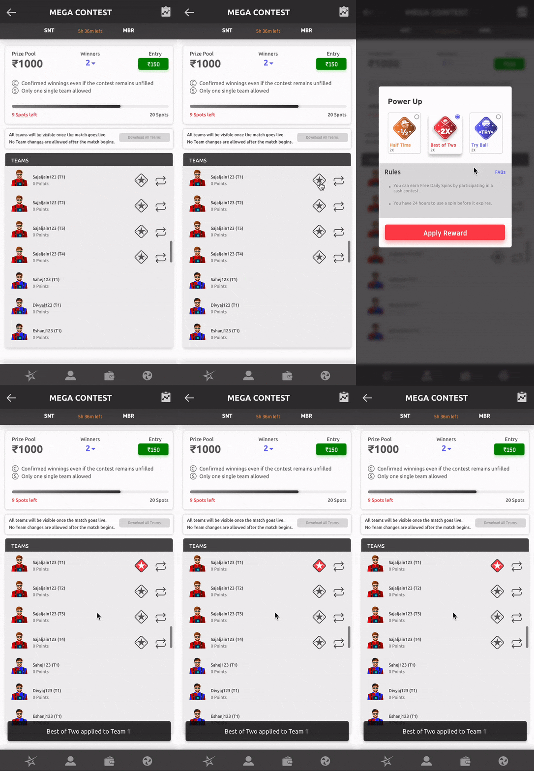
Final User Interface
Here are some snaps from the final UI.


Results
Skilsta was withdrawn from the market too early for us to measure results.
Standing out as a Sustainable Construction Venture
The team set out to establish brand awareness and legitimacy. Early steps in the business required a branding identity and a website that could communicate just what makes ArmKon different. We iterated through several logo options keeping in mind the long-term vision of the project and landed out Web Designs with conventional designs that stood out because of the unique colour scheme. During early stages, the core goal of the brand was to create a lasting ‘first impression.’
Overview
ArmKon was launched in India with one single mission – to provide an absolute alternative to the state of construction industry in India. The industry is fraught with corruption, malpractices and safety code violations throughout the nation.

ArmKon envisions a future where construction is no longer dependent on the exploitation of Indian labour.
Users & Audience
Sales in the construction industry take a long time, and the business model is based on project-oriented long term payoff. Thus, the first few years of ArmKon were to be spent prospecting to various stakeholders. Investors, partners, suppliers and even workmen use varied sense of judgement before deciding if they wish to engage with a certain firm.
Relationships are forged over time as the ‘eventual payoff’ is often used to scam. The industry is notorious for midway scope-creeps and contractors that run away with money, especially in smaller projects.
The goal of this project was to resonate the principles of the brand which were thus far communicated in one-on-one meetings. Every touchpoint was to become a reminder of the 4 towering pillars of ArmKon’s brand.

While the primary focus of the website was to impress and inform the commercial stakeholders, the consumers were also kept in mind during the process. Two main types of consumers were identified – novices and contractors.
Novices were people who had little experience of construction activities, these were end-consumers looking for assistance in housing, or small-scale commercial construction.
The contractors were people who would sub-contract the construction, or a part of the construction project to ArmKon. These users were well-informed and were looking for information like previous projects, certifications and contact details.

Roles & Responsibilities
Role:
Web Designer, Brand Designer
My major responsibilities included:
- Prototyping & UI Design
- Sourcing appropriate media like images, videos & icons
- Brand Identity design
Other members:
- Ex-Adobe Project manager & Software Developer
- Client – US based Project manager in large-scale construction projectsEx-Adobe Project manager & Software Developer
- Client – US based Project manager in large-scale construction projects
Scope & Constraints
~ 1 month turnaround time & limited research
The client had bootstrapped the project so far and the branding and website were an assets intended to be utilised towards gaining initial investments.
As this was the first strategic process to be executed, information on user behaviour was scarce. Standard UX conventions and client’s practical experience were the only source of truth that guided us.
Brand Identity
The Colour Palette
We were lucky to have a visual reference for colours shared by the client. The colour palette made symbolic sense, and the aesthetic approval was a bonus.
The warmth of the cream tones exuded a greatly humanised appeal of the brand. It was this colour that singularly carried the sustainable, safety-first approach of ArmKon.
The other half of the palette was equally purposeful. The dark steel blue is a colour that is omni-present in the construction industry. Heavy machinery, plumbing and even shipping scenes carry these hues that stand for strength, trust and reliability.

The colour palette was slightly unconventional for construction industry. Most brands adopted yellows, oranges and reds among the warm hues and light to dark blues in among the cold hues. Our unique combination served as a great asset in distinguishing the brand visually and positioning it in the market, on an axis of its own.

True to my usual style, the colour palette was kept minimal. Some exceptions were made in the UI wherever required.
Exploring Logo & Type
An initial competitor analysis revealed that most competing brands had a logo mark to go along with their logotype. This allowed for brand placement on large machines such as cranes that are visible from a long distance. Usually, these machines will stay on site for 4-8 months, which helps with brand recall through repetition.

Condensed, heavy-set fonts with high cap height are conventionally used in industrial logos. This was an obvious option but while these fonts were perfect in order to display strength and reliability, they lacked personality. We needed to find a balance between the strength of condensed fonts and the humanism of geometric sans serifs.

Branding with a Vision
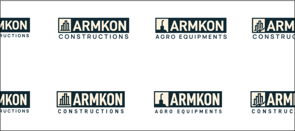
ArmKon Constructions was the first step towards a series of ventures under the parent brand ArmKon. This meant the logo had to be modular to accommodate the vision of the team.
All logo options were presented in a series format to make sure the visual direction maintained enough flexibility from the very beginning.

Typography
Having experimented with many condensed typefaces, we ended up settling for DIN 2014 Bold font for the logotype with additionals in Manrope Semibold font. And with approval on the typography and logo mark, I proceeded to make finer geometric adjustments along improvements in alignment.

We went ahead with Mikhail Sharanda’s Manrope as the Primary Typeface to be used in titles, buttons and other elements of greater importance. For body text, text buttons and other low-emphasis elements, we decided to use Christian Robertson’s Roboto. A global favourite with an expansive set of glyphs with italics.


Final Logo Output

The logo mark was constructed to keep the brand values at the forefront of brand identity and to leave space for expansion in the future. A separate logo mark was created to avoid disturbing the logo type. The four towering values and the path to success form the backbone of ARMKON. Every attempt at improving or expanding the brand must keep in mind this line of thought for consistency.

In the Wild
A logo on an artboard is a cake in the oven, the real test happens on the plate you serve. We assembled a set of mockups that aligned with the founding teams vision. A towering skyscraper, a sound-proofed boardroom and a pair of premium business cards.


Early Prototypes
The design process began somewhere in the middle. The client shared with us a set of rough wireframes for most important sections. This helped us shape the Information Architecture, while we worked towards building the Wireframes.

We made the mistake to rush into designs with loads of assumptions. Consequently, the samples I shared for visual direction did not align well with the client’s vision. On the bright side, we did get approval for the colours and typography. The layouts appeared a bit out of norm and the imagery was declared incompatible with the on-ground reality.


There was great emphasis on fitting-in at this stage. The brand needed to stand out without appearing experimental. This was made possible with conventional layouts built in an unconventional colour scheme.
Developer Handoff
The least favourite yet the most rewarding part of the process was completed in a few hours. SVGs & PNGs of icons were packed and zipped. Font styles were compiled and appropriately assigned in the Figma file and shipped to the developer.


Final UI
Riding the IPL Wave with AR Filters & More
Overview
Crooze organised a virtual cycling league called Indian Pedalling League 2022 for its users in May 2022. The campaign required extensive graphics for Social Media and print designs for Goodies. I designed campaign and team logos, social media templates and two AR Filters for Instagram and Facebook and goodies like Medals, Certificates, Booklets and more.
Process & What we did
The First Drafts
Having been working with the Crooze team since 5 months, we knew what exactly what to do and it had to be done quick. Our spirits were high and we got the CIPL Logo & Team Logos ready in only half a day.


Social Media Templates
Our Instagram page had always been our super strength and it was time to spread the CIPL fever all over Instagram. I prepared some quick templates in a couple hours.


Brand Awareness with AR Filters
The campaign was an excellent opportunity to reach more people. It was my responsibility to ensure that we are express our brand at every touchpoint.
I used Spark AR to build Instagram AR Filters with our branding. The filters would allow our users to support their teams by sharing selfies and videos from biking trips.
My prior experience in Blender’s 3D environment and vanilla JavaScript came in handy.

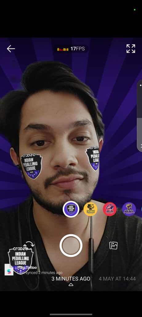
In the Wild
The filters were a massive success drawing more than 8000 impressions as of 27th May, 2022.
We expect to reach 15000+ users users by then end of Crooze Indian Pedalling League 2022 campaign by June 5.

The users were also seen using them in very creative ways.


You can try these filters here:
Using Brand Strategy to Guide Web Design for A Hollywood Picture Cars Company
Overview
Picture Car companies provide brokerage for cars and other vehicles used in movies. For a new interface, it was crucial to first understand the customers and their core problems. We started with some Brand Story workshops, moving into wireframes and finally a responsive web UI.
Roles & Responsibilities
Worked with Owner – 15+ years in Hollywood
Worked with PM & Web Developer
Supervised Junior Content Writer
My Role – Brand Strategist & Web Designer
Responsibilities:
- Brand Strategy
- Copywriting
- UX/UI Design
Process & What we did
A film production requires hundreds of people from distinct backgrounds serving different needs. The existing approach among all the competitors was to provide a catalogue of their collection with some contact details.
The larger goal of the project was to achieve differentiation in the niche. Early discussions revealed the straight-to-work attitude among customers. We had to figure out differentiate ourselves while avoiding any kind of marketing junk to fill up the website.
I lead some workshops based on Donald Miller’s Story Brand model.
Understanding the Customer Base
The workshop was conducted with various stakeholders from Hollywood.
With his extensive experience working in film production, the Owner shared great insights regarding the nature of the business and the competitive landscape. We were constantly reminded that the primary factor that drove sales was trust. On a movie set, every hour costs thousands of dollars so it is imperative to ensure that the picture car will be delivered to the well before time.
Plus, with advances in cinematic imaging, the audience can actively point out inaccuracies in the model. Thus, it was important to assure that we have personally vetted our vehicles to avoid last minute surprises.

Insights:
- Time is of the essence, every hour can add thousands of dollars on a shoot day.
- Period and Aesthetic accuracy of the model is of chief importance.
- Trust, faith and reliability sustain the customer relationship.
Content Comes First
I cannot possibly overstate the importance of shaping a marketing website around the content. Thousands of brilliantly designed websites fail because of poor copywriting or designs that compete with the copy. I have seen countless websites with generic designs that consistently get results with compelling copy. The goal is to use design as a tool to aid in this communication.
I designed some initial wireframes for landing pages and product pages along with some other elements.

Designing for Users that don’t have the time to read
A majority of users were visiting to simply access our catalogue or to get contact details. They could be on the set or on their phone so we knew that they were definitely going to skip over any large chunk of text.
This meant that the content had to be distilled into easily readable chunks with visual aides like icons and images.


Distilling Vehicle Condition into a Score
A big issue with picture cars is that the brokers often have unverified vehicle images received from vehicle owners. By placing the condition data along with the product listing, we were able to reinforce our commitment to transparency.

10 features of a vehicle were identified. Often times Art Directors would not mind if some features are missing. For example, a car chase scene wouldn’t require a working stereo.
Pushing Car Owners for Better Images
The sweetest ride can look poor with bad shots. This can severely impact the listing. So, I added some instructions for car owners to take better images at the listing form stage.

Final UI
Here are some snapshots from the final UI

Leading the First UX Research for a Fitness Rewards App
Overview
The team was looking for UI improvements but initial discussions revealed that we were missing data-led discussions and UX vocabulary. So I conducted some workshops to understand the business and UX surveys to create user personas, and finally a detailed competitive analysis. This post deals with the second part of the project.
Problem Statement
Existing user insights were wishful or anecdotal. User Personas needed to be corroborated with proper research findings.
Roles & Responsibilities
Worked with Founder & CEO – First Bicycling Mayor of India
Worked with PM, Business Strategy – Ex-Entrepreneur, Ex-Adobe
Supervised Junior UX Designer
My Role – Product Designer
Responsibilities:
- Project Management
- Product Vision Alignment
- UX Research
- UX/UI Design
Scope & Constraints
Scope: Entire UI redesign, Addressing UX gaps & Adding new features
Constraints:
- Very little previous research
- On-ground interviews not possible
Process & What we did
Planning the Survey
Given the scale of the app, we reduced the number of personas down to two from the three earlier. The existing personas gave little insight about user needs and were more like customer personas.
We were not confident about the personas we made, and stakeholders were equally confused. So, we decided to run a user survey to corroborate our hypotheses and generate insights.
A total of 23 questions were selected from six clusters:
- Demographics
- Usage & Approval
- Competition
- Features
- Problem Solving
- Discovery
Most of the questions were objective and some were open ended. We used Google Form for the survey and Google Sheets for analysis.
Incentive & Bias
The current positioning of the app is all about free rewards. This was a great incentive to get survey responses but also introduced bias. As people were expecting to ‘win’ rewards, they were more likely to provide higher approval ratings.
Responses & Analysis
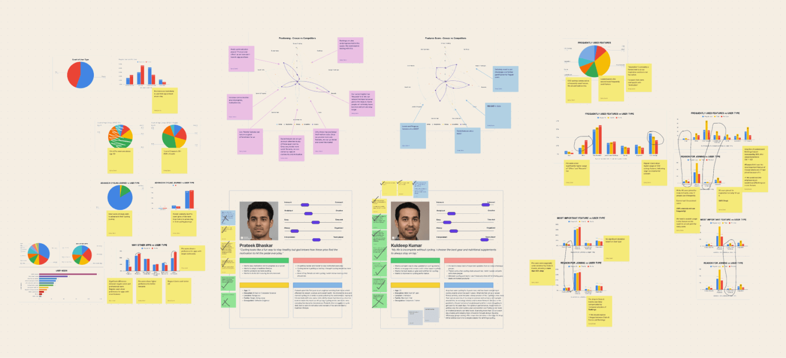
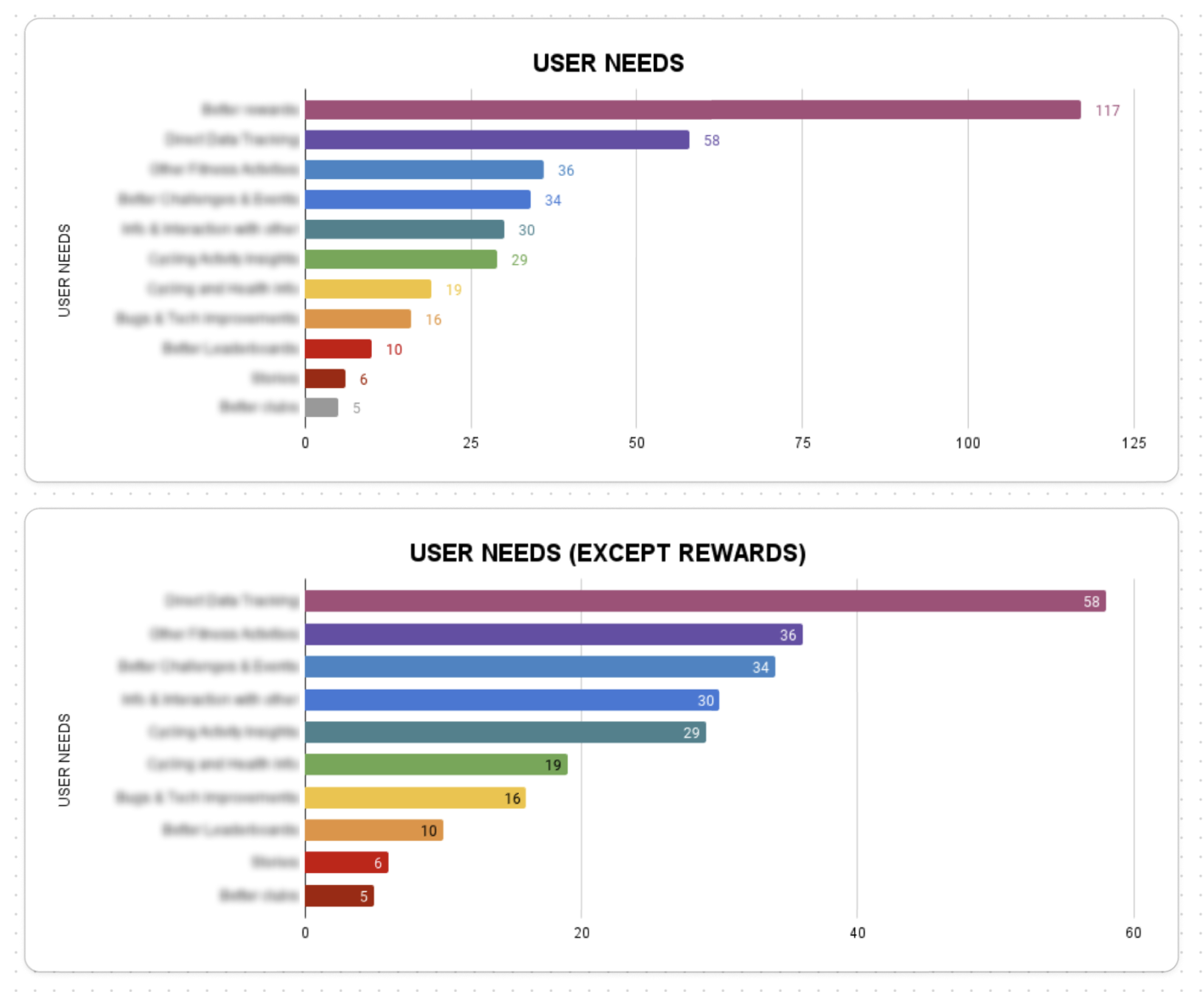
We received an overwhelming response with over 50% active users filling our survey. We had hundreds of open-ended responses, which we further grouped into 11 categories.
Around 30% of the responses were used as first person statements seeking resolution under the following categories:
- Frustrations
- Doubts
- Bug Fixes
- Ideas

Generating Insights
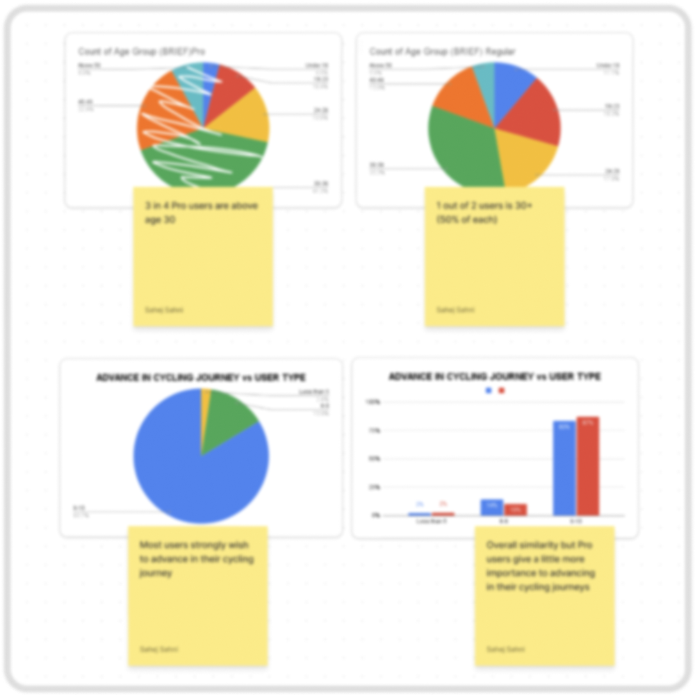
We used more than 50 graphs to analyse the survey responses. Comparisons were drawn based on two main criteria: Age and Level (beginner or professional cyclist).
The insights have been marked confidential and cannot be shared publicly.


Impact & Results
The survey helped us do the following:
- Create more accurate user personas
- Prioritising features and builds based on user feedback
- Invalidate product expectations
Aligning Stakeholder Vision with User Experience for a Fitness Rewards App
Overview
The team was looking for UI improvements but initial discussions revealed that we were missing data-led discussions and UX vocabulary. So I conducted some workshops to understand the business and UX surveys to create user personas, and finally a detailed competitive analysis. This post deals with the first part of the project.
Problem Statement
The team is brimming with excellent but diverse ideas, and we need to align towards a single vision for a realistic product plan.
Roles & Responsibilities
Worked with Founder & CEO – First Bicycling Mayor of India
Worked with PM, Business Strategy – Ex-Entrepreneur, Ex-Adobe
Supervised Junior UX Designer
My Role – Product Designer
Responsibilities:
- Project Management
- Product Vision Alignment
- UX Research
- UX/UI Design
Process & What we did
Understanding and Aligning Vision
Crooze has a fairly complicated business model. It was critical to understand and also align the vision of the product among the team members before making any changes to the product. I conducted a Lean Canvas workshop.
The best part about these workshops is that they allow us to confront the stakeholders without challenging their vision.
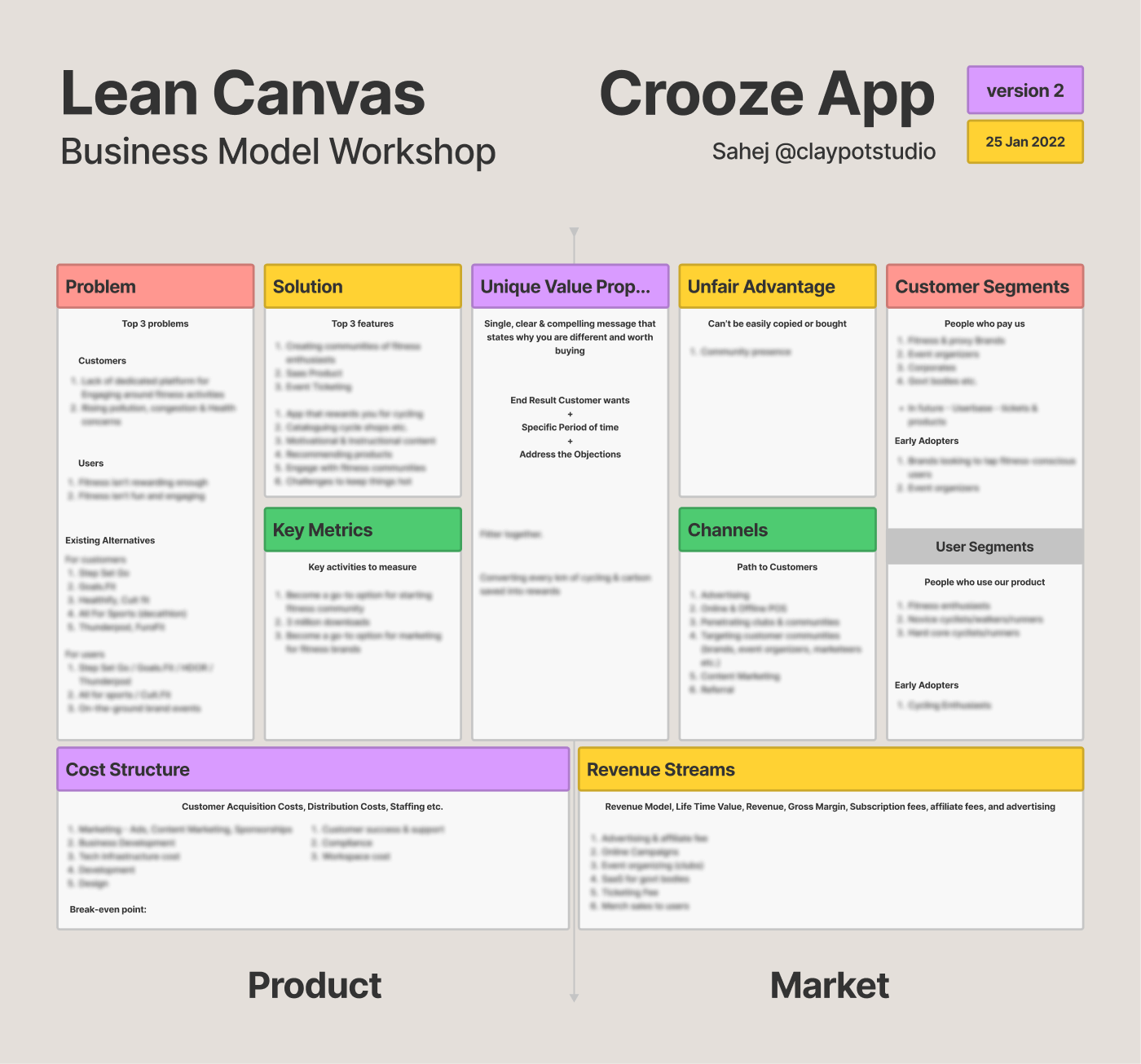
Insight: The value proposition was good for acquiring users but bad for business. We had to switch to a proposition centred along community rather than rewards. This decision had been looming over the team for months, but the workshop allowed to push it over the finish line.
Narrowing Down Product Vision
There were gaps in what the product was actually offering. So I asked the stakeholders to support their top four value propositions with first person statements from a user’s point of view. If the stakeholders couldn’t justify it, then it was time to lose it.
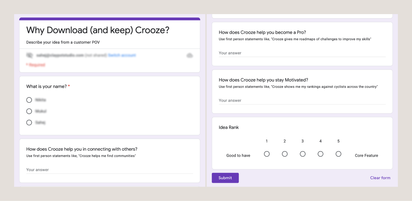
Less than 30% of promises were actually supported by the existing product. Most required upgrades and additions, and more than 30% were removed.
Outcome & Results
Conversations became more frank and based on realtime ideas. Distinction was drawn between things Crooze needs to be and things Crooze would like to be in a distant future. We were ready to step into the UX side of things now.
Read about it here.


