Standing out as a Sustainable Construction Venture

The team set out to establish brand awareness and legitimacy. Early steps in the business required a branding identity and a website that could communicate just what makes ArmKon different. We iterated through several logo options keeping in mind the long-term vision of the project and landed out Web Designs with conventional designs that stood out because of the unique colour scheme. During early stages, the core goal of the brand was to create a lasting ‘first impression.’
Overview
ArmKon was launched in India with one single mission – to provide an absolute alternative to the state of construction industry in India. The industry is fraught with corruption, malpractices and safety code violations throughout the nation.

ArmKon envisions a future where construction is no longer dependent on the exploitation of Indian labour.
Users & Audience
Sales in the construction industry take a long time, and the business model is based on project-oriented long term payoff. Thus, the first few years of ArmKon were to be spent prospecting to various stakeholders. Investors, partners, suppliers and even workmen use varied sense of judgement before deciding if they wish to engage with a certain firm.
Relationships are forged over time as the ‘eventual payoff’ is often used to scam. The industry is notorious for midway scope-creeps and contractors that run away with money, especially in smaller projects.
The goal of this project was to resonate the principles of the brand which were thus far communicated in one-on-one meetings. Every touchpoint was to become a reminder of the 4 towering pillars of ArmKon’s brand.

While the primary focus of the website was to impress and inform the commercial stakeholders, the consumers were also kept in mind during the process. Two main types of consumers were identified – novices and contractors.
Novices were people who had little experience of construction activities, these were end-consumers looking for assistance in housing, or small-scale commercial construction.
The contractors were people who would sub-contract the construction, or a part of the construction project to ArmKon. These users were well-informed and were looking for information like previous projects, certifications and contact details.

Roles & Responsibilities
Role:
Web Designer, Brand Designer
My major responsibilities included:
- Prototyping & UI Design
- Sourcing appropriate media like images, videos & icons
- Brand Identity design
Other members:
- Ex-Adobe Project manager & Software Developer
- Client – US based Project manager in large-scale construction projectsEx-Adobe Project manager & Software Developer
- Client – US based Project manager in large-scale construction projects
Scope & Constraints
~ 1 month turnaround time & limited research
The client had bootstrapped the project so far and the branding and website were an assets intended to be utilised towards gaining initial investments.
As this was the first strategic process to be executed, information on user behaviour was scarce. Standard UX conventions and client’s practical experience were the only source of truth that guided us.
Brand Identity
The Colour Palette
We were lucky to have a visual reference for colours shared by the client. The colour palette made symbolic sense, and the aesthetic approval was a bonus.
The warmth of the cream tones exuded a greatly humanised appeal of the brand. It was this colour that singularly carried the sustainable, safety-first approach of ArmKon.
The other half of the palette was equally purposeful. The dark steel blue is a colour that is omni-present in the construction industry. Heavy machinery, plumbing and even shipping scenes carry these hues that stand for strength, trust and reliability.

The colour palette was slightly unconventional for construction industry. Most brands adopted yellows, oranges and reds among the warm hues and light to dark blues in among the cold hues. Our unique combination served as a great asset in distinguishing the brand visually and positioning it in the market, on an axis of its own.

True to my usual style, the colour palette was kept minimal. Some exceptions were made in the UI wherever required.
Exploring Logo & Type
An initial competitor analysis revealed that most competing brands had a logo mark to go along with their logotype. This allowed for brand placement on large machines such as cranes that are visible from a long distance. Usually, these machines will stay on site for 4-8 months, which helps with brand recall through repetition.

Condensed, heavy-set fonts with high cap height are conventionally used in industrial logos. This was an obvious option but while these fonts were perfect in order to display strength and reliability, they lacked personality. We needed to find a balance between the strength of condensed fonts and the humanism of geometric sans serifs.

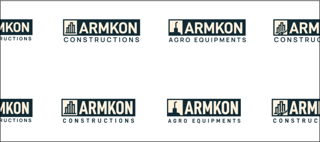
Branding with a Vision
ArmKon Constructions was the first step towards a series of ventures under the parent brand ArmKon. This meant the logo had to be modular to accommodate the vision of the team.
All logo options were presented in a series format to make sure the visual direction maintained enough flexibility from the very beginning.

Typography
Having experimented with many condensed typefaces, we ended up settling for DIN 2014 Bold font for the logotype with additionals in Manrope Semibold font. And with approval on the typography and logo mark, I proceeded to make finer geometric adjustments along improvements in alignment.

We went ahead with Mikhail Sharanda’s Manrope as the Primary Typeface to be used in titles, buttons and other elements of greater importance. For body text, text buttons and other low-emphasis elements, we decided to use Christian Robertson’s Roboto. A global favourite with an expansive set of glyphs with italics.


Final Logo Output

The logo mark was constructed to keep the brand values at the forefront of brand identity and to leave space for expansion in the future. A separate logo mark was created to avoid disturbing the logo type. The four towering values and the path to success form the backbone of ARMKON. Every attempt at improving or expanding the brand must keep in mind this line of thought for consistency.

In the Wild
A logo on an artboard is a cake in the oven, the real test happens on the plate you serve. We assembled a set of mockups that aligned with the founding teams vision. A towering skyscraper, a sound-proofed boardroom and a pair of premium business cards.


Early Prototypes
The design process began somewhere in the middle. The client shared with us a set of rough wireframes for most important sections. This helped us shape the Information Architecture, while we worked towards building the Wireframes.

We made the mistake to rush into designs with loads of assumptions. Consequently, the samples I shared for visual direction did not align well with the client’s vision. On the bright side, we did get approval for the colours and typography. The layouts appeared a bit out of norm and the imagery was declared incompatible with the on-ground reality.


There was great emphasis on fitting-in at this stage. The brand needed to stand out without appearing experimental. This was made possible with conventional layouts built in an unconventional colour scheme.
Developer Handoff
The least favourite yet the most rewarding part of the process was completed in a few hours. SVGs & PNGs of icons were packed and zipped. Font styles were compiled and appropriately assigned in the Figma file and shipped to the developer.


Final UI


